Exploring generative AI with Midjourney


Well. Sometimes it happens. This is built with an experimental version of css, it might not work on your browser. If your device is heating now, it is because of this beauty.
A year ago, I joined Listminut — renamed Ring Twice since then — and took on a new role: Product Manager. Until that moment, I always worked on the agency side, and I felt the need to take on more responsibilities and move toward an in-house job in a Product company. From the moment I started, two things were certain: I had zero experience as a product manager, and I was going to face a ton of challenges along the way. The first year confirmed how good that prediction was.
One of the first things I did in my first days was to go around everyone to understand what was working well, what was not, and what was creating frustration in the team... For example, a recurring problem on projects was never knowing what the latest version of a document was, not knowing who had this latest version, etc. The first change made was, therefore, to switch to a more modern stack of tools built for collaboration. Exit .docx documents, Exit Photoshop... and hello Dropbox Paper and Figma. We also started using an issue-tracking tool — We chose Height for its high flexibility to fit our startup's evolving process and — to follow up on bug reports and improvement requests.
For every newcomer at Listminut, the onboarding process is designed so people gradually work on larger projects. After a few weeks, the first “real” big project I worked on has been a disastrous failure at the moment. I think I made all of the possible mistakes I could have made:
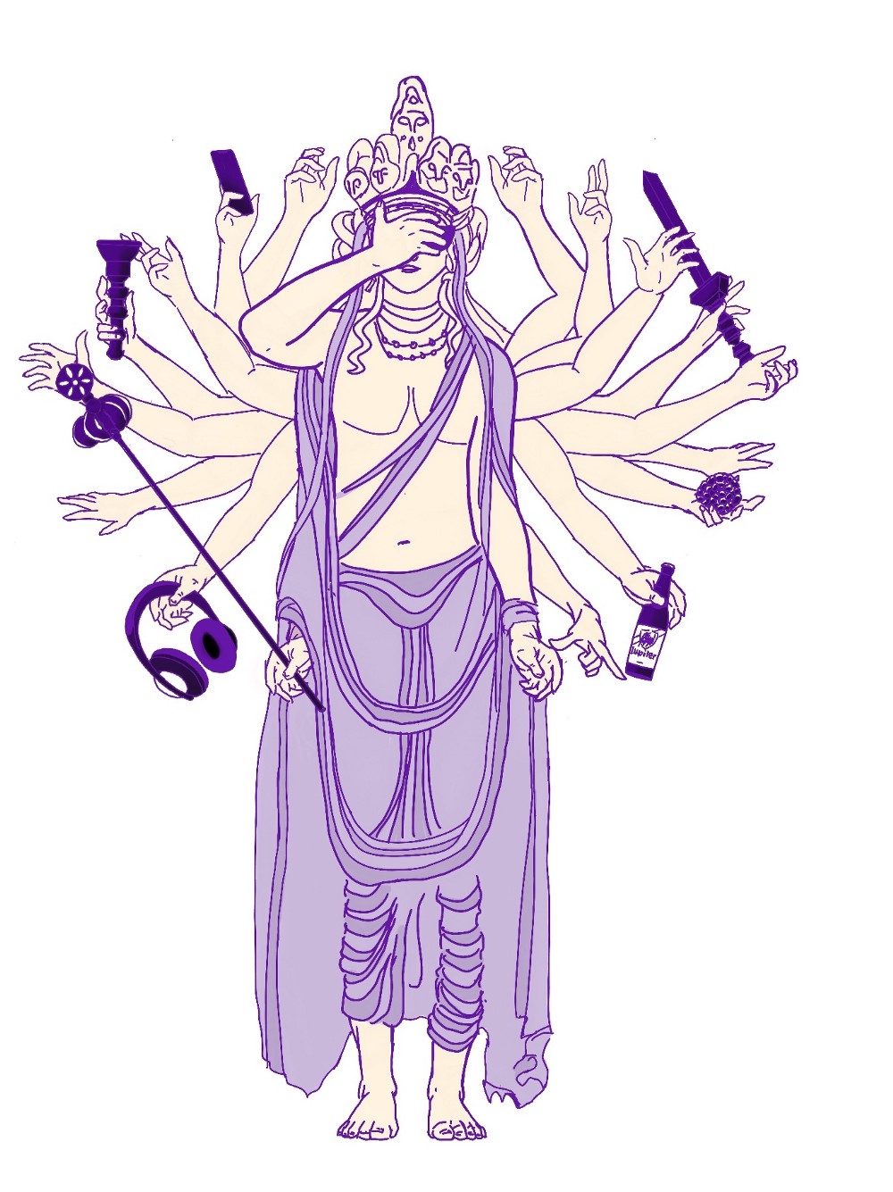
This project, called "RAA" internally, was by far the worst but also the most formative. Paradoxically, if I had to do it again, I'm not sure I would do it differently. I have the feeling that I will have made all these mistakes, sooner or later, on other projects and that it helped me realize very early on a lot of things that should be taken care of from now on.
One important lesson I learned with the "RAA" project was the challenge of having a balance between 3 things:
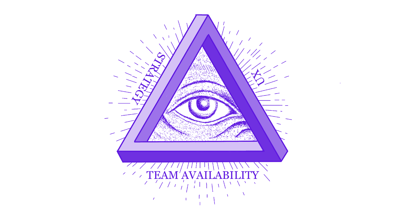
I find that balancing act incredibly difficult, and I am still not completely comfortable with all the underlying mechanics. It's not an exact science, different team members will often have different perspectives.
Any desire you might have to create something or change something must be well-studied, discussed, and calibrated. For example, a feature I'd like to build to boost activation is an in-app notification system. Today we're relying too much on emails and pop-ups to communicate with our users. Creating such a feature could help reduce the frequent situations where several banners and/or pop-ups are competing for users' attention on the same page, but it's also likely that would be a big project to develop and maintain and it's probably not the best neither to move forward along our current strategy. Having a company culture where communication is key and everyone is accountable helps tremendously.
The role of a Product Manager itself is also comparable to a balancing act. From the beginning and up until now, it was difficult to define what exactly that role at Listminut would correspond to and how its responsibilities previously shared between the other people on the team would be redistributed and redefined.
In a "Product" scale-up in hyper-growth with tens/hundreds of employees, we generally find the same type of organization: Small teams — called Squads — of 7–8 multi-disciplinary profiles (a product manager, a product designer, a data analyst, and multiple developers…). Apart from those people, several other profiles could overlap such as “Product Owner”, “Design Manager”, “Head of Product”, you name it… At Listminut, although the team has doubled in size this year, we are not yet at the hyper-growth stage and we are not yet in this configuration of squads. It is therefore necessary to be able to wear several hats.
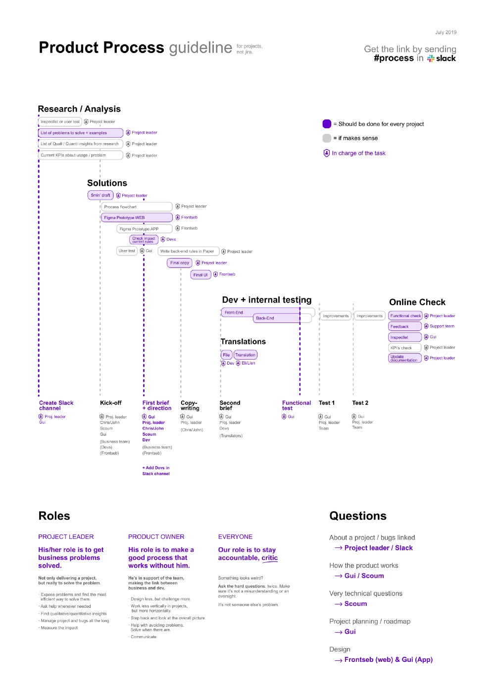
I do the very "operational" tasks that are generally carried out by a Product owner (write briefs, test new features, document things, communicate with the devs, etc.), more tactical tasks (create a product process, test new ways of doing things and tools all the time, question everything) and I also participate in strategic tasks that are generally carried out by our three co-founders. I also, more often than I should do now, find myself designing screens to fill gaps.
Before joining the team, I was very apprehensive about the relationship I would have with the only designer. I knew we had two different designer profiles (he is more into UI and front-end, and I'm more into UX). I wanted to avoid being the 'new sheriff in town', revolutionizing and changing a lot of things, but I also wanted to have a certain degree of control over the direction that would be taken for the design of our applications. In the beginning, on some projects, there was a bit of friction — and even some small clashes — between us. I was really struggling to find the balance between challenging his work and imposing the direction I wanted to take. Over time, we worked on that, by better defining who was responsible for what and by challenging each other. I still do a lot of design tasks (prototyping, thinking about systems, and a bit of visual design, especially for our Mobile app), but I learned to let go and trust more. We are now much better aligned, and our relationship has become great.
The way I imagine the future is to gradually delegate the UX side to a product designer (or should I call it a UX designer?). I guess it would allow me to free up time to do things that we currently don't do enough or to do them better: user testing, improving velocity, helping align the growing team towards clear common objectives, better qualifying potential projects to have a more predictable/significant impact on the business…
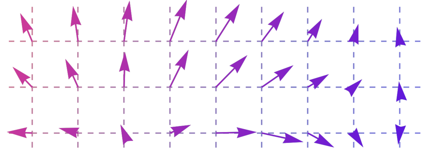
My role is difficult to put in a box because it evolves every day. I mentally picture my role as one of the people who must help the team grow in terms of product maturity, which obviously involves learning myself and then spreading what I have learned.
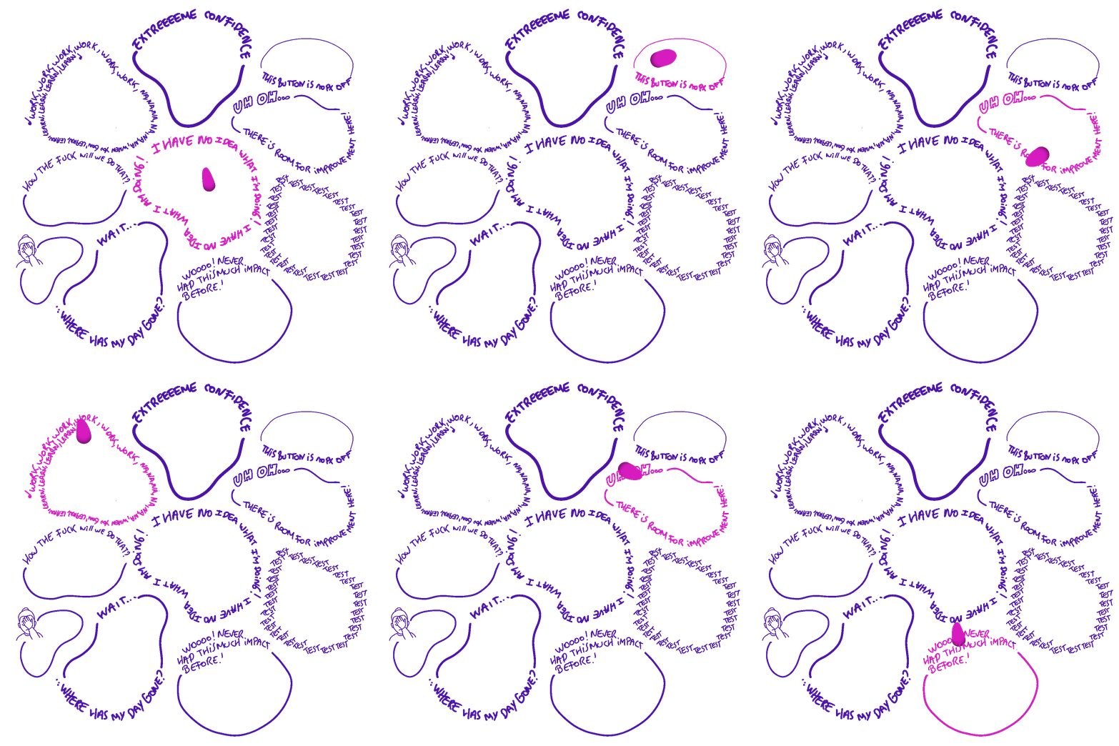
To conclude and give my feelings about this first year, deciding to join a startup-scaleup like Listminut was clearly a winning decision. It's not a super easy job because a lot is expected from me, the bar is set high and it's my responsibility when anything product related goes wrong, but it's a great job where I never get bored. I go all day long through a lot of diametrically opposed feelings and states of mind. For those who enjoy moving outside of their comfort zone, playing with lots of problems, testing things, and learning, it's a really great position. I am confident that during the next year, I will do lots of things that I don't do yet, I will continue to learn, a ton, and I will have helped the team move toward our next objectives.
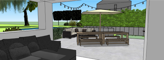
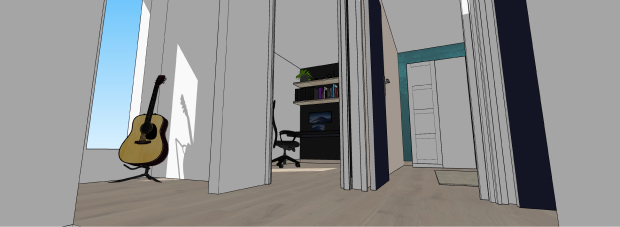
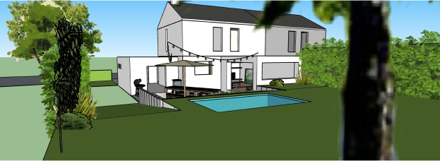
It’s like it’s rooted in my DNA. I often make my relatives crazy with prototyping, like when I hang blankets with pieces of wood in the kitchen during a few days to « experience the volumes » of our future kitchen; or when I modelize in 3d the whole house just to test different designs.
As a UX consultant, I've been told that I needed to be extreme, without concessions, in my recommendations to improve UX. It was my role to fight for the users and that was the very reason why our clients paid us. They wanted to be challenged on that topic, they wanted to integrate the user experience perspective in their decisions. But while I understood the importance of this UX role, I was very often frustrated for not having enough context on the other parts of the business — like the acquisition strategy, the company objectives, the available ressources, internal politics... — that have a huge impact on the experience eventually delivered.
I wanted to learn how to find the right balance between all the different aspects that are taken into account when you're trying to build a successful product.
Ring Twice is currently a small team of 12 people. We're creating a marketplace that connects people looking to outsource small tasks/jobs to trusted local service providers. Ring Twice has already found its market fit, has 200.000 users and is the leader on its market (Belgium).
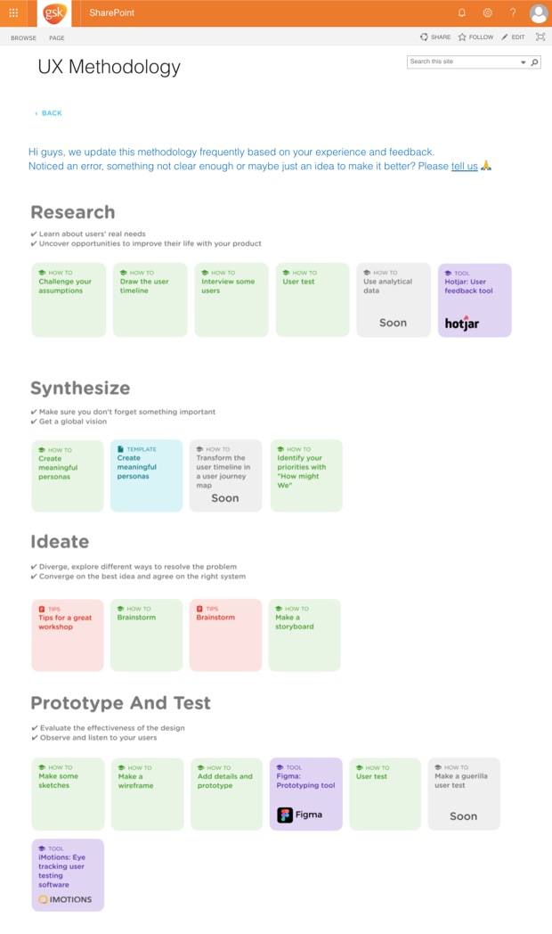
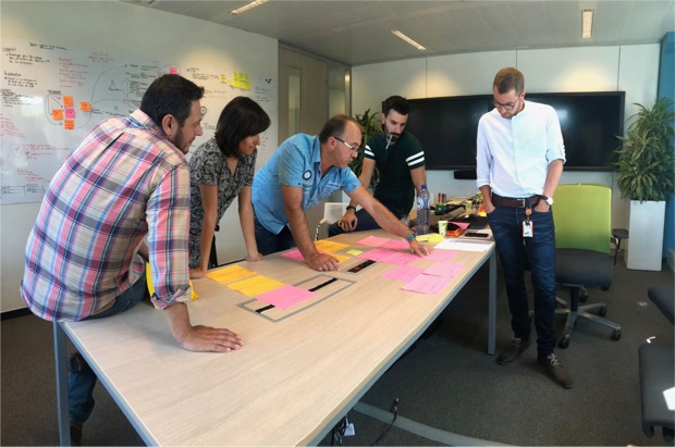
GSK Vaccines is doing its digital transformation. Their Tech department (±300 people) is slowly adopting principles like Agile and UX. In that order, they hired me to coach project leaders during their process of redesigning internal applications.
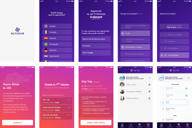
Altissia is the provider of the applications allowing European students who participate in the Erasmus Exchange program to test their language levels and to improve it thanks to e-learning courses. My mission was to design the brand new mobile application as there was only a desktop app at the time.
Hello bank! is a 100% digital bank. They are working on several apps (crowdfounding, mortgage...) gravitating around the traditional banking app. I prepared, moderated and analyzed the user test sessions taking place every month, then presented the insights to the team.
Dapesco specialises in guiding and advising large organisations about all of the many issues involved with energy management. In that order, they created Jool, an application to easily manage the creation of reports and the administration of the system. My job was to guide them with the design of the new app.